Trailforks Introduces Trail Grade Visualization
You may, or may not have already noticed that we recently incorporated elevation/grade visualization into the Trailforks app. Grade visualization has been a requested feature for quite some time, but it took us a while to find a solution that we were happy with.
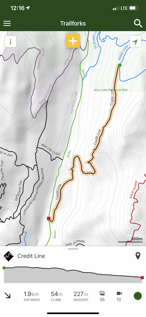
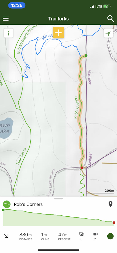
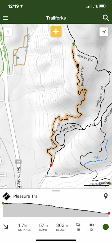
Let's look at the problem. Trails have different distances and different elevations, but within the app we had limited horizontal and vertical space to represent these differences.
We started by integrating a few different visualizations into the app to test and better understand the usability of each.
The question we asked ourselves was, how can we represent the grade to instantly convey to the user an understanding of the trail characteristics?
Our solution
We really like this solution as it's clean and simple.
At a glance this gives the user more knowledge of the trail they are about to ride.
Nerd talk beginning. These are some of the goals and work we did to make all this happen.
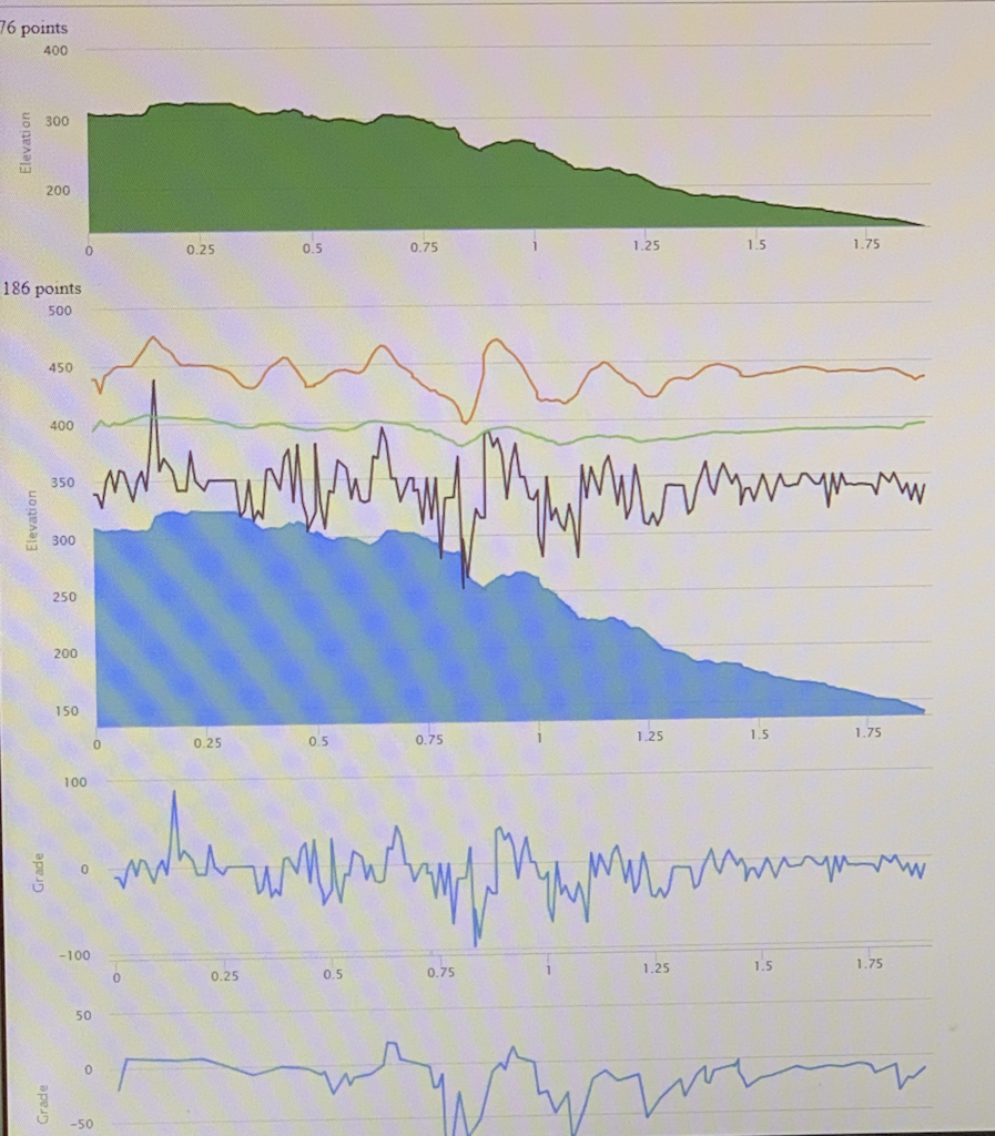
1. Create an in-house custom elevation service for the whole World.
2. Increase localized accuracy of elevation service data by augmenting data with millions of rides
3. Regenerate all trail data points with equidistant points mapped to new more accurate elevation points.
4. Real time signal process the elevation data to filter out noise yet preserve important signal.
5. Represent the data to provide the user instantaneous understanding of trail characteristics.
Hope everyone enjoys this new feature and please leave us some feedback and suggestions on this and future improvements and features.
Let's look at the problem. Trails have different distances and different elevations, but within the app we had limited horizontal and vertical space to represent these differences.
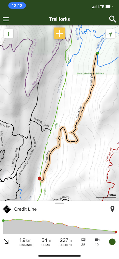
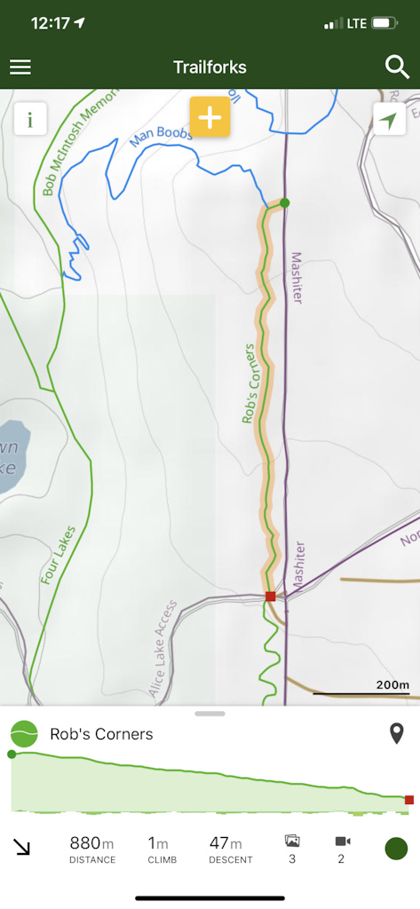
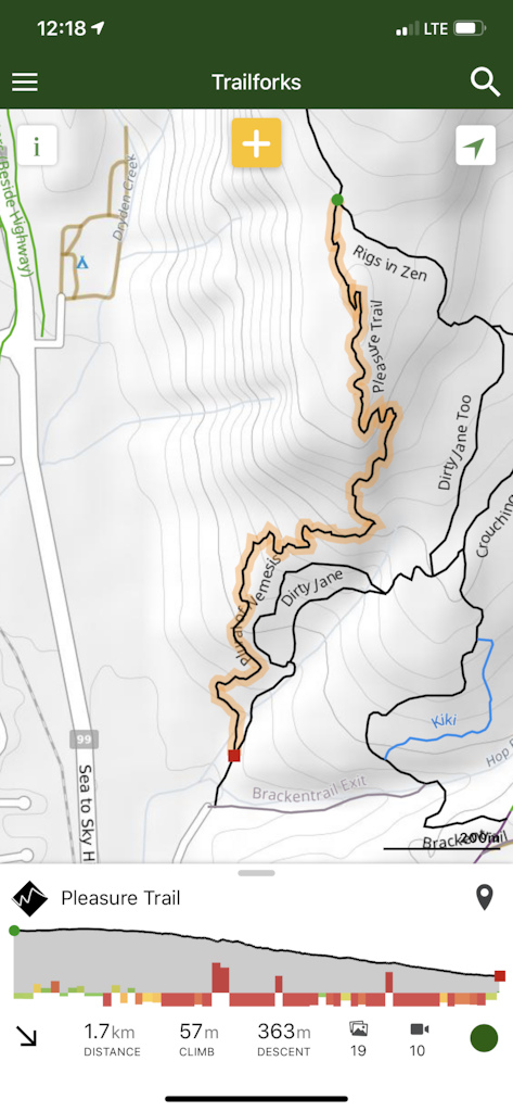
Here are 3 different trails that visually have similar elevation profile charts. From this it's hard to determine what kind of a ride this will be unless we start digging into the details like the numeric distance, elevation and difficulty of the trail.
We started by integrating a few different visualizations into the app to test and better understand the usability of each.
These do solve the issue of representing absolute grade, but we were still not happy. In all these cases a user is required to visually associate the color grade with the elevation profile line to determine if the grade is related to an uphill or down hill.
The question we asked ourselves was, how can we represent the grade to instantly convey to the user an understanding of the trail characteristics?
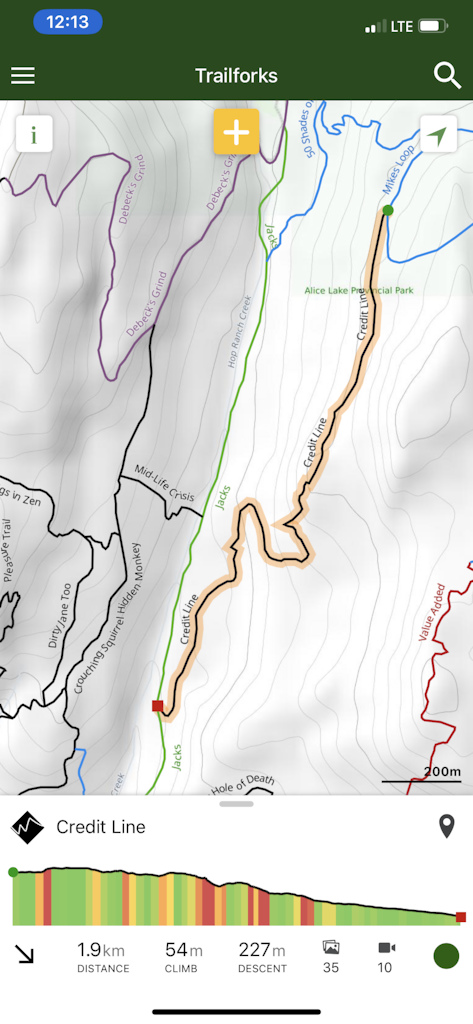
Our solution
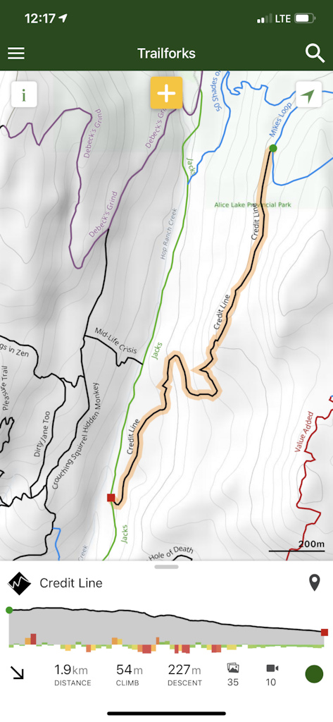
Using the trail Credit Line as an example, it looks like there is a punchy climb at the beginning of the trail, followed by a few ups and downs, finishing with a low grade pedal section.
Here we represent the grade data with different colors and different height bars. The color and height of the grade bars are directly proportional to the absolute grade. The grade bars can extend above or below to represent if this is an uphill or downhill section of trail.
We really like this solution as it's clean and simple.
At a glance this gives the user more knowledge of the trail they are about to ride.
Nerd talk beginning. These are some of the goals and work we did to make all this happen.
1. Create an in-house custom elevation service for the whole World.
2. Increase localized accuracy of elevation service data by augmenting data with millions of rides
3. Regenerate all trail data points with equidistant points mapped to new more accurate elevation points.
4. Real time signal process the elevation data to filter out noise yet preserve important signal.
5. Represent the data to provide the user instantaneous understanding of trail characteristics.
Hope everyone enjoys this new feature and please leave us some feedback and suggestions on this and future improvements and features.
Author Info:
Must Read This Week




Data flows in rivers these days and is used to paint many pictures but making meaning from it is not done so well. Thank you Pinkbike for a great place to "talk" and a sweet app to take on our rides.
But you're right, we can never be perfect and there will always be corner cases.
When you start recording your ride, it leaves a bread crumb on the map realtime as you ride showing you where you are and have been.
@Veloscente : Yes, this view is available on the app as you track/record your ride. So you can see where you are with respect to this grade data.
I think trailforks complements any handle bar mounted device. Trailforks is better to explore and get a good idea where one is, but if you have a ride in mind and load it to a handle mounted device, it's easier to just follow the device instead of pulling out your phone.
To learn my new zones far and wide. And close to home. You guys keep
Doing this shit and you’re staying way ahead of comparable apps.
Thanks pb for doing this!
Since then I have learned to do a bit more studying of routes before embarking on new trails.
privacyinternational.org/report/2647/how-apps-android-share-data-facebook-report
digitalcontentnext.org/blog/2018/08/21/google-data-collection-research
"For comparison’s sake, a similar experiment found that on an iOS device with Safari but not Chrome, Google could not collect any appreciable data unless a user was interacting with the device.".
We are going to double check, but our app only interacts with fb when you decide to use "login with fb". If you don't use that feature then there is no interaction with fb at all. And if you do it only interacts one time on the login screen to do the login verification.
Thank you for making Trailforks, it's a great service and I use it through the website. If the app some day becomes tracker free I'll surely use it
The tracker app test you pointed to just scans the app for the existence of a code library. Say in the case of fb. Yes there is a lib that will be used to do the fb login, but only when you actually decide to use that feature. If you never do a fb login, there is never any kind of call made to fb. How do you envision us making it work for someone like yourself, but yet still have the ability to provide a feature for those who choose to use fb login?
The best way to instantly understand the trail characteristics is to put away your phone, then go ride your bike. Right away.
A ribbon map on the basemap (preferred direction) would be helpful. I am not aware of anything that does this?
The reason why we think that the fully shaded graph without direction bars is less ideal is that you are forced to relate the color to the sometimes minor, compressed, or hard to see elevation changes in the profile graph to figure out if the grade is related to uphill or downhill. Also with colors and bars we have more resolution in that not only can we represent a grade with a few shades of color, but also with the size of bar and the direction of the bar. We can convey more information/data to the user.
The trail direction and therefore the elevation profile on trailforks is from green circle to red square. This trail direction is computed from millions of trail ride logs and recommended to be set that way to the associations. So a trail is made a particular direction because say 80% of the riders ride it that way. Of course you may ride it the other way and the default elevation profile and the grade will be backwards but I think people already intuitively compute that in their head. If the slope shown is downhill from left to right, but if im riding backwards, then i'm actually going uphill.
We might even make this easier by having a button to toggle the direction and therefore switch the elevation profile and grade graphs for the user.
Anyone else have such issue?
I love your app, it's the only reason for a smart phone
Thanks PB and TF!
Also there is a "planned" option when adding a trail. A planned trail is only visible to those that have admins to an area, which should be associations and builders in a region.
Once you add a trail, you simply sync the region and the planned trail along with grade info will be available on the app ( if you have admin ) . You also can see what the grade is at any point in the trail by sliding your finger on the elevation chart.
Example: www.pinkbike.com/photo/16876980
This makes me want to go ride Pleasure again, such a good trail!
This is exactly why I choose to ride a long travel 165-180mm broduro bike instead of a DH bike in gravity situations now. There's always punchy uphills in the middle of the so called "downhill trails". Now the app lets me know ahead of time. Nice.
I’m assuming it’s pretty flat, but it might have a nipple twist or two in there...